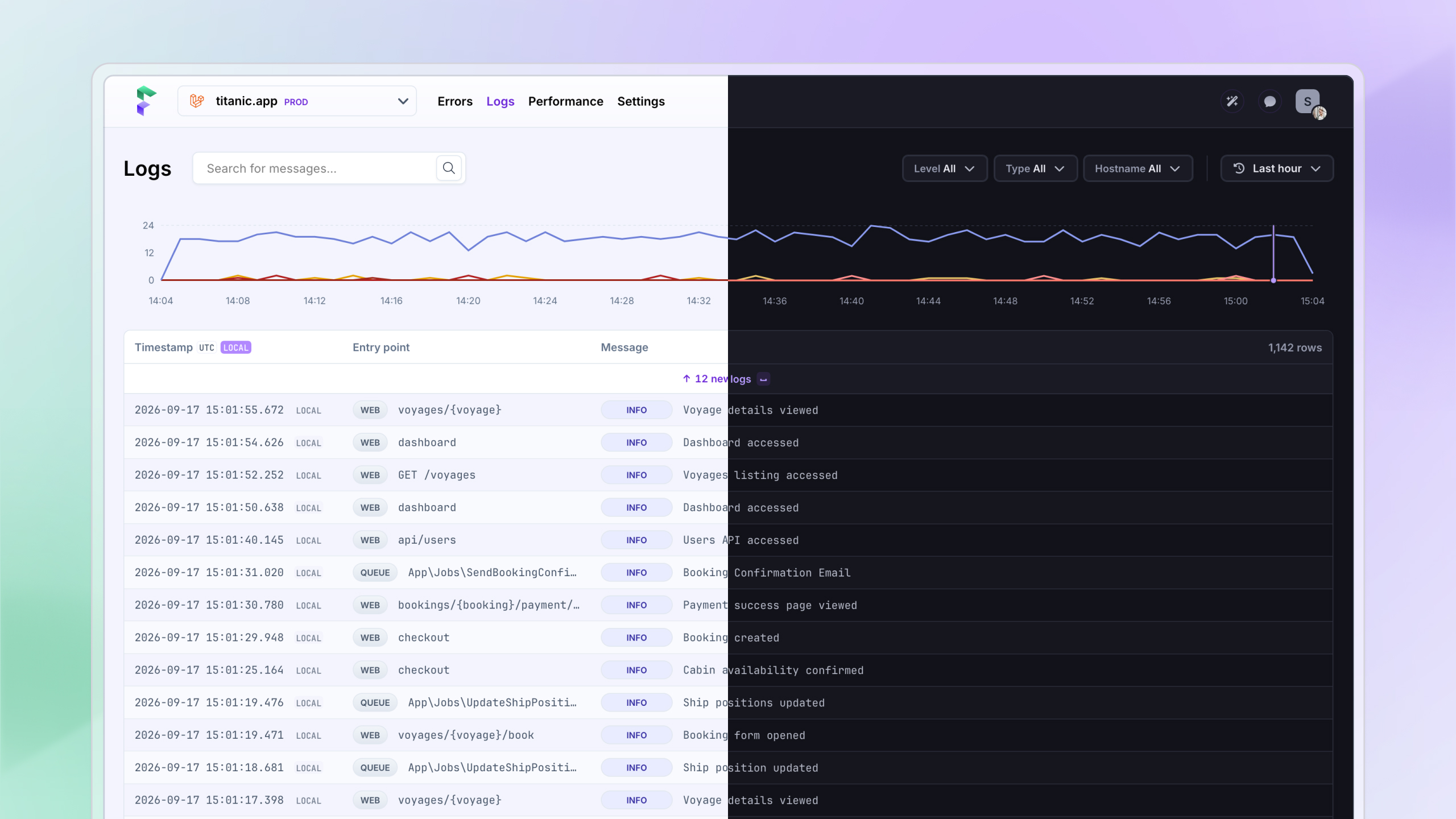
Over the years we heard from many of you that you wanted a dark mode for Flare. We always put it at the bottom of our to-do list, because it's a big task to do right.
But we've finally done it! Making sure the colours of the dark palette fit the existing theme of the app, while keeping it accessible, wasn't easy.
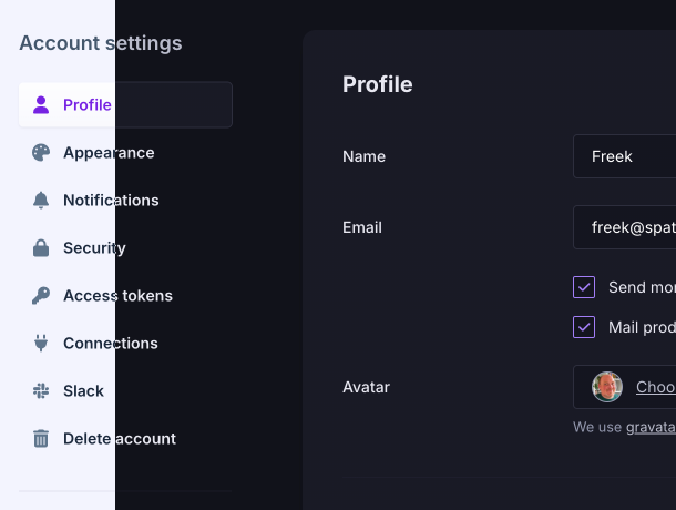
You can turn it on under Account → Appearance, or straight from the menu behind your avatar. Pick Light, Dark, or Match my system.
Some of the things we learnt
Shadows don't really work in dark mode
We use shadows on some surfaces to separate them from the background, and this works well in a light theme. Once everything turns dark, it becomes a lot harder: black on black doesn't always work, and turning your black shadows white creates a glow effect. Not what you want.
Instead, we used light borders to recreate that separation from the background.
Some of our gradients were unusable in dark mode
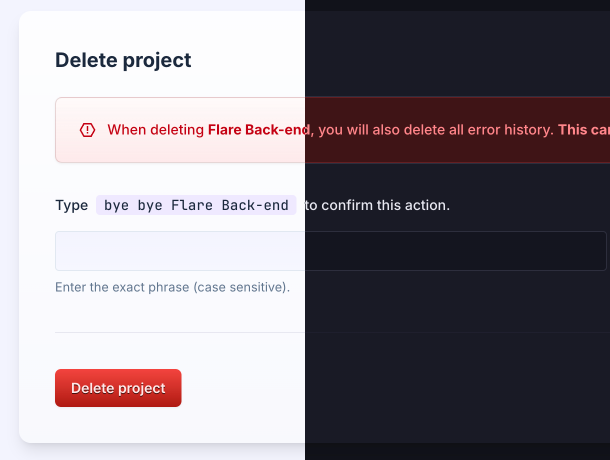
We have a fun, glass-looking colour gradient that is mostly used on the flash messages you see in Flare. Because there is some opacity involved to achieve this effect, the gradients didn't work in dark mode at all.
To make them work in dark mode, we reversed them. We took the red of the text and used it as the background colour, and the more faded red of the light mode background became the text colour.
The CSS variables were not ready
We already had all our colours in CSS variables, so we assumed we were good to go. But we made a mistake: our variables were named after colours, not roles. A name like --fl-purple-light doesn't describe what it's used for.
So we introduced a semantic layer of tokens: --canvas, --surface, --line, --fg-muted, and so on. Once we had this, creating a new theme became very easy. The hard part was getting there: our components used the old colour names 1,323 times. We used AI for the first pass. Most of those were straight renames, like text-fl-gray becoming text-fg-muted. The rest needed a closer look, because one old colour was often doing two different jobs, like white being both a card background and the label on a purple button.
After our first pass, we found some hardcoded hex value stragglers here and there, which were easy to clean up. Next, we used Playwright to take screenshots of the same pages on the main branch and on our dark mode branch, and pixel-matched them to check that everything still looked the same in the light theme.
Finally, it was just a matter of creating a dark theme next to our light theme. Our components only ever use the token names, like bg-surface or text-fg-muted, so a dark theme is nothing more than a second set of values for the same tokens:
/* Light theme, the default */
:root {
    --canvas: var(--fl-gray-30); /* #f3f4fd */
    --surface: var(--fl-white); /* #ffffff */
    --line: var(--fl-gray-90); /* #e2e8f0 */
    --fg-muted: var(--fl-gray-540); /* #64748b */
    --elevation-card: 0px 10px 15px -3px rgba(0, 0, 0, 0.05);
}

/* Dark theme: the same tokens, different values */
.dark {
    color-scheme: dark;

    --canvas: #111219;
    --surface: #191a24;
    --line: var(--fl-gray-800); /* #2c2e3c */
    --fg-muted: var(--fl-gray-370); /* #9599ad */

    /* Shadows disappear on dark grounds, so a 1px border takes over */
    --elevation-card: 0 0 0 1px var(--line);
}

/* Tailwind turns the tokens into utilities like bg-surface and shadow-card */
@theme inline {
    --color-canvas: var(--canvas);
    --color-surface: var(--surface);
    --color-line: var(--line);
    --color-fg-muted: var(--fg-muted);
    --shadow-card: var(--elevation-card);
}
A component doesn't need to know which theme is active:
<div className="rounded-lg bg-surface p-4 shadow-card">
    <p className="text-fg-muted">Looks right in both themes, without a single dark: class.</p>
</div>
Happy with the result
It feels great to finally cross this one off our to-do list, and we learnt a lot along the way.
Give it a try under Account → Appearance, or from the menu behind your avatar. Spotted a screen that still looks off in dark mode? Let us know, and we'll fix it.
Continue reading
Automatic breadcrumbs recording and GDPR consent
The latest JavaScript client can record breadcrumbs for you: the clicks, navigations, and HTTP requests a user made before an error, so you can retrace their steps. We also added a consent hook, so nothing is sent to Flare until a visitor accepts your cookie or GDPR banner.

Dries
Every exception has a backstory: introducing previous exceptions in Flare
Flare now shows previous exceptions. Navigate the whole chain and see the stack trace of the exception that actually caused the failure.

Ruben
Subscribe to Backtrace, our quarterly Flare newsletter
No spam, just news & product updates