Summary view
Flare has a separate page for each entry point (routes, jobs and commands) as well as for queries, external HTTP, and views.
These pages all have the same key elements:
Filters
Use these to search or filter your data. Most views share the same filters, with some exceptions. You can filter by time (averages, p95, etc.) or text (route name, method, query, etc.). When you apply a filter, all data on the page is updated, including graphs and tables.
Graphs and stats
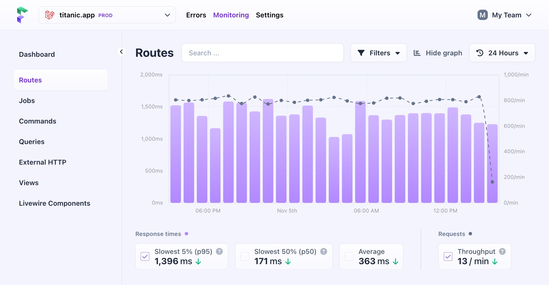
In the summary view, you'll see a bar graph for response times and a line graph for request throughput. The data in these graphs are combined values from all entries within this view.
Just below the graph are all the different metrics you can display on the graph. These are grouped by their unit: response times are in milliseconds, while throughput is in minutes. You can select one metric per group to display on the graph.
Hovering over the points in the graph shows you metrics for that specific period.
A scroll bar appears to allow you to scroll through the data if you select a time period that contains too much data to fit on the graph.
Table
The table shows all entries for the selected view, with columns displaying the same data as represented by the graphs above.
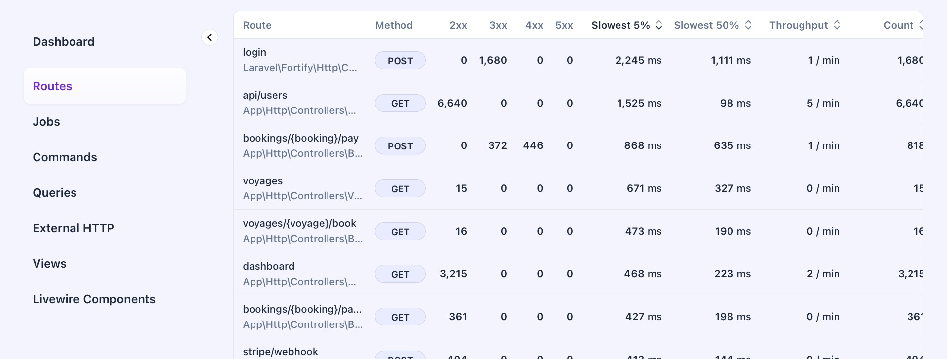
Some of these columns can differ per type, like the request method for entries and external HTTP requests.
Columns with numerical data can be sorted from low to high or high to low. By default, tables are sorted by the slowest 5% of entries.
Tables with lots of data are paginated to make them easier to navigate.
- On this page
- Filters
- Graphs and stats
- Table

