Dashboard
Routes, jobs, and commands represent the entry points of your project. Queries, along with operations including external HTTP and views, are triggered by these entry points.
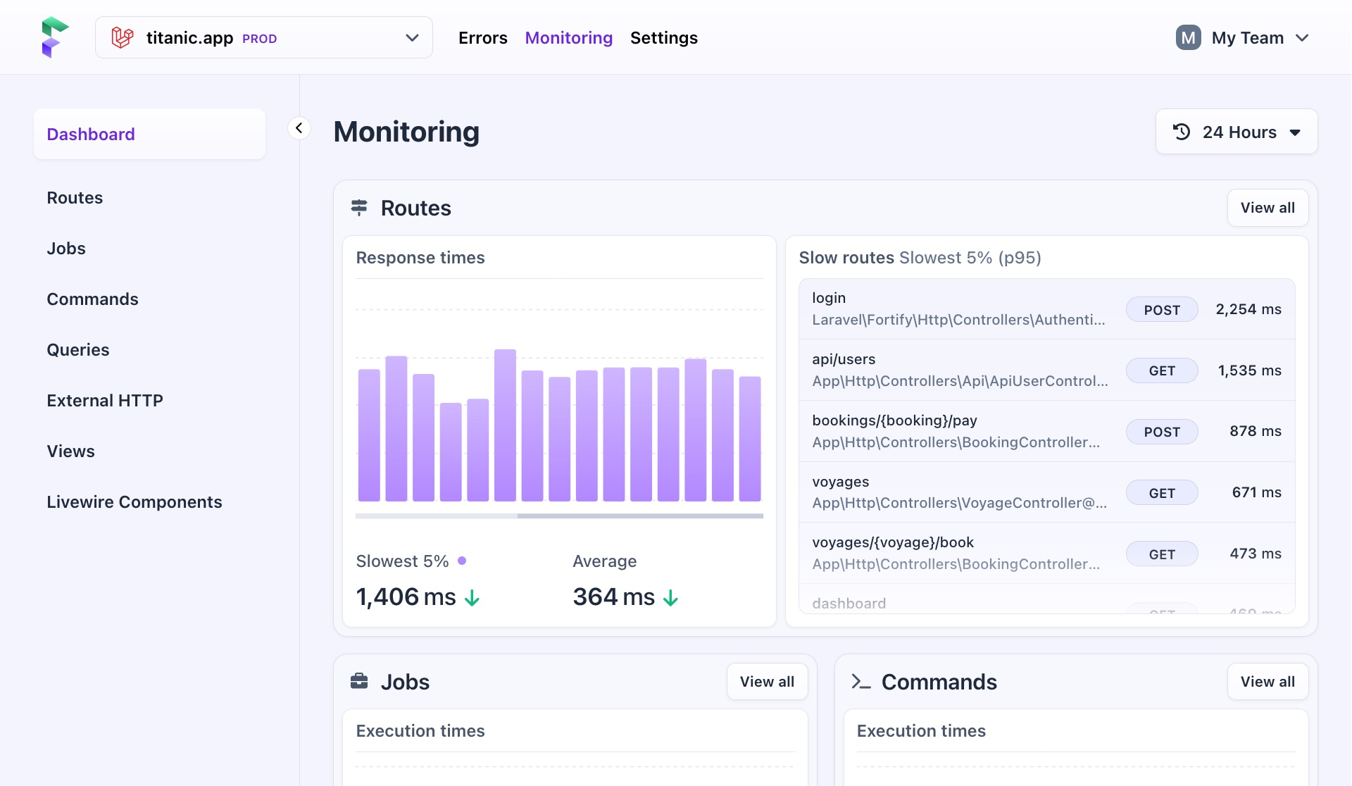
On the dashboard, all this data is brought together.
Data on the dashboard
The dashboard has cards for each entry point and for queries.
Routes
Shows you all tracked requests in your project, displaying the slowest 5% (p95) and average response times on a graph, along with a list of the slowest routes, their controllers, and request methods.
Jobs & Commands
Shows you all executed queued jobs and commands, highlighting the slowest 5% (p95) and average execution times on a graph.
Queries
Shows you all database queries, including those executed by routes, jobs, and commands. It shows the slowest 5% and average execution times on a graph, along with a list of the slowest running queries.
Changing the time period
Performance data is real-time, so you need control over it. By default, Flare shows data for the last 24 hours, enough to spot outliers that may have started recently. On the graphs, this sets the scale to one hour.
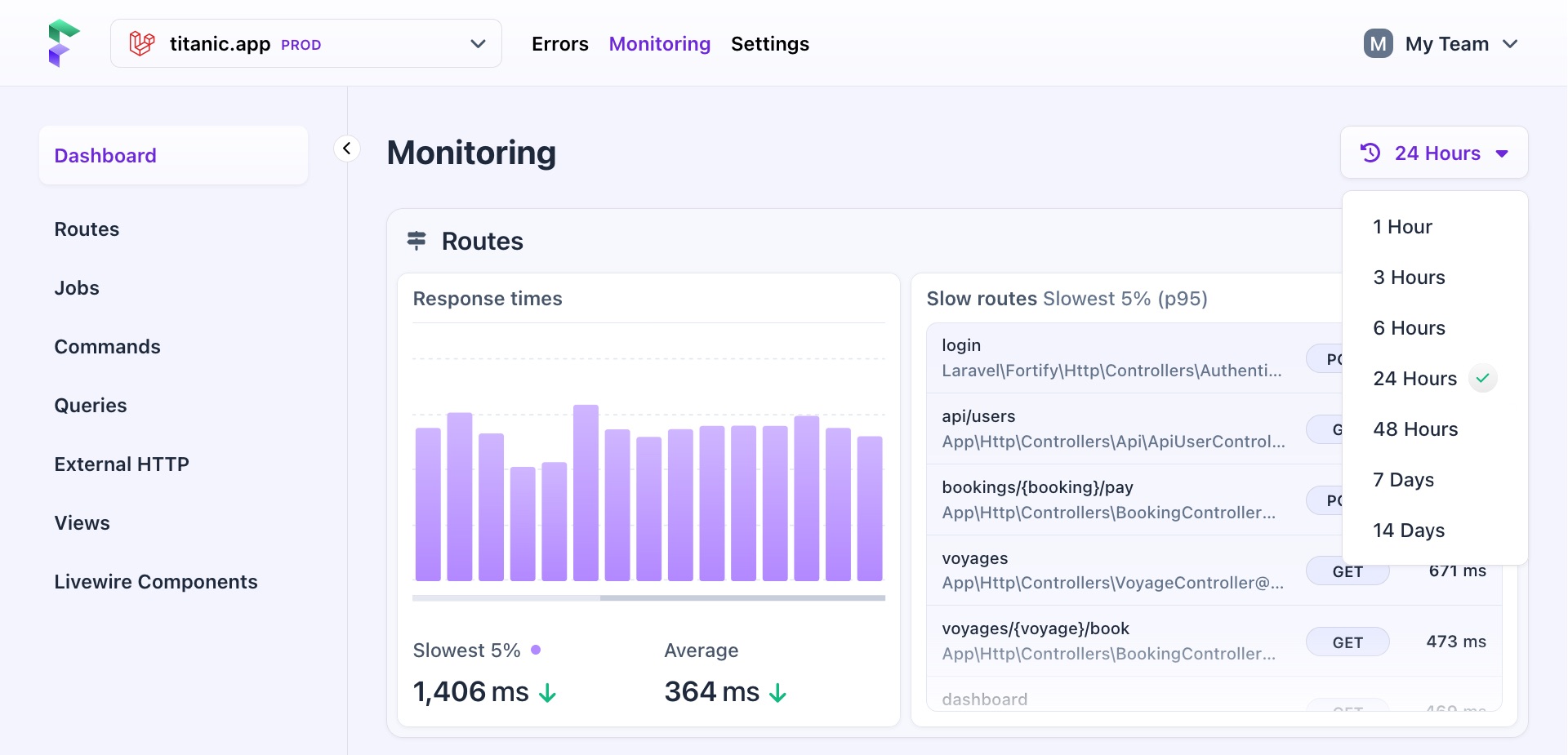
You can use the dropdown in the upper right corner to increase or decrease the amount of data you see, from one hour to 14 days. This can help you identify a very recent problem or look at performance changes over a longer period of time.
| Period | Scale |
|---|---|
| One hour | One minute |
| Three hours | One minute |
| Six hours | One minute |
| 24 hours (default) | One hour |
| 48 hours | One hour |
| 7 days | One hour |
| 14 days | One day |
The selected time frame is applied throughout, adjusting the numbers and scale in all graphs and tables.
- On this page
- Data on the dashboard
- Changing the time period

